In This Guide
Lower saturation tends to read as calmer
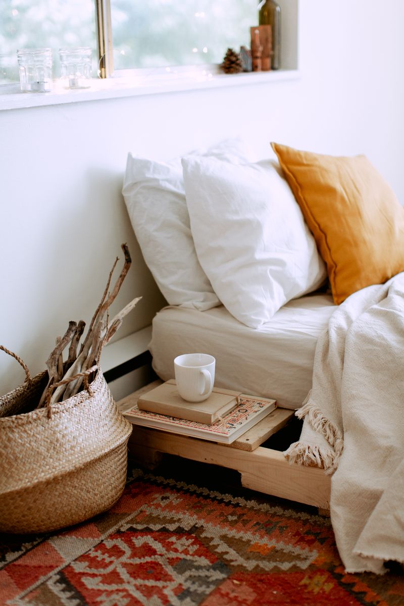
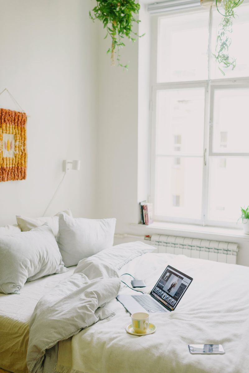
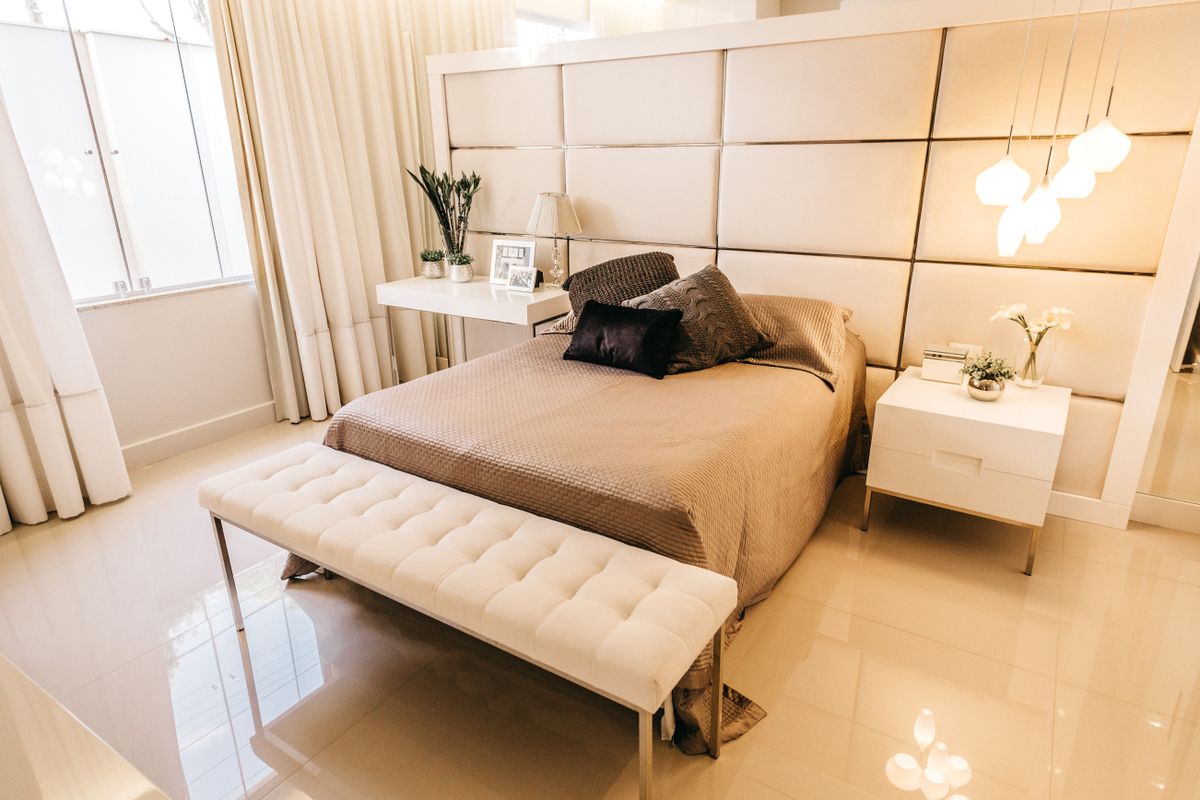
Muted, lower-saturation versions of colors — dusty blues, soft sage greens, warm greiges — generally feel more restful than bright, highly saturated tones, which can feel more energizing than relaxing in a space meant for sleep.
Limit the palette to two or three tones
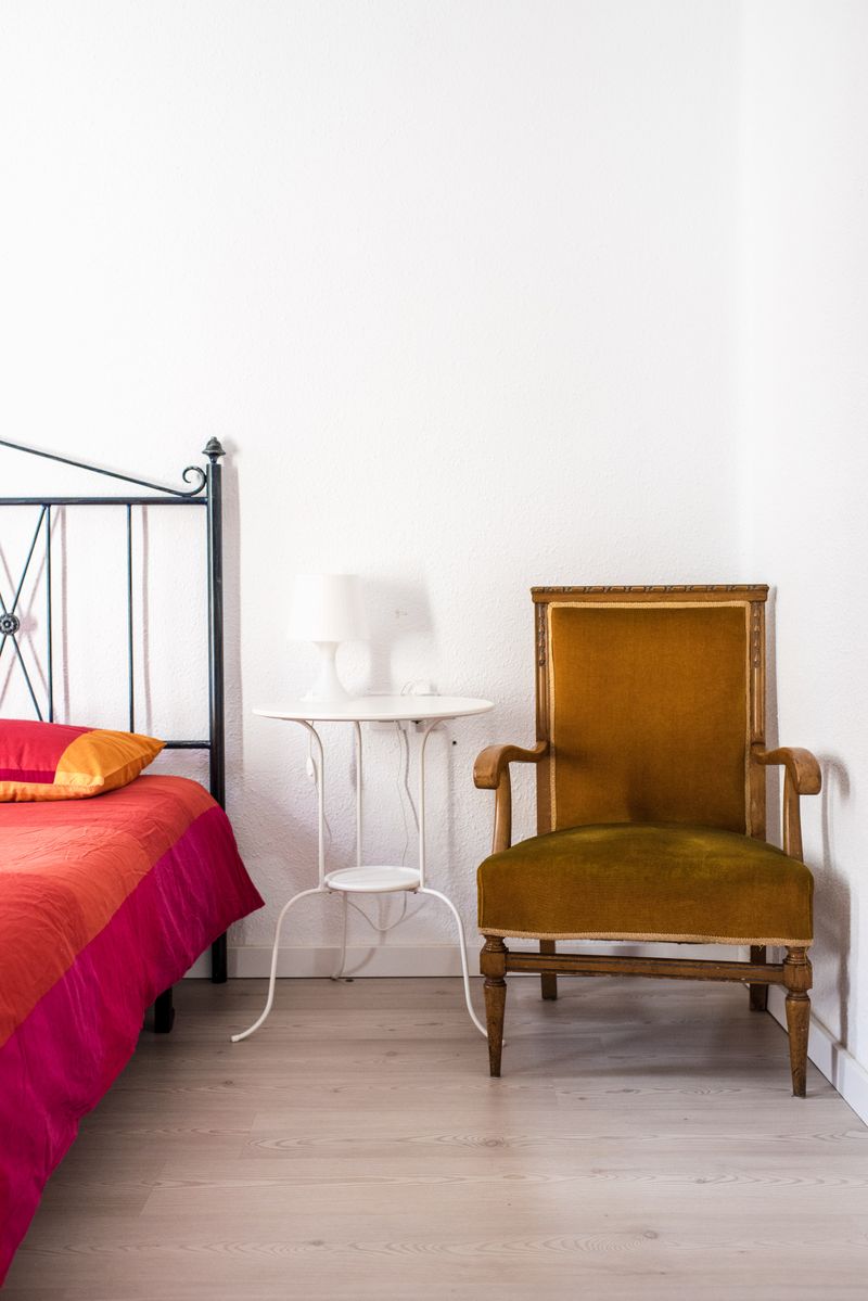
A simple palette (a wall color, a bedding tone, and one accent) tends to feel more cohesive and calm than a room with many competing colors and patterns.
Consider how the color looks at night
Since bedrooms are often used in low light — early morning and evening — testing a paint color under lamp light, not just daylight, can prevent an unwelcome surprise once the room is finished.
This article is for general informational and educational purposes only and does not constitute professional advice. Home and Lifestyle Guide may earn a commission from affiliate links at no extra cost to you; this never influences our independent editorial recommendations. See our Advertising Disclosure and Editorial Policy for details.